Just drop me a line and I'll get you in!
I was looking at delivery data with my PM and noticed something we'd been hiding from ourselves: Express deliveries that arrived ahead of schedule were averaging 13–15 minutes. Our checkout page told users to expect 25 minutes.
That's not a minor under-promise. That's a different product. In parallel, we'd been watching the quick-commerce wave in India — Zepto, Blinkit, Swiggy Instamart. Sub-15-minute delivery had moved from gimmick to category.
Jakarta's density profile looked similar. We thought the demand signal would translate.
A 10-minute gap between promise and reality — an opportunity sitting in plain sight.
Before building, concept testing and rapid guerrilla sessions confirmed the value proposition. Users got it — speed of delivery was the headline, the 15-minute promise was credible, and SKU-level eligibility didn't confuse them. We shipped.
The MVP had two design decisions that, in hindsight, explain everything that followed.
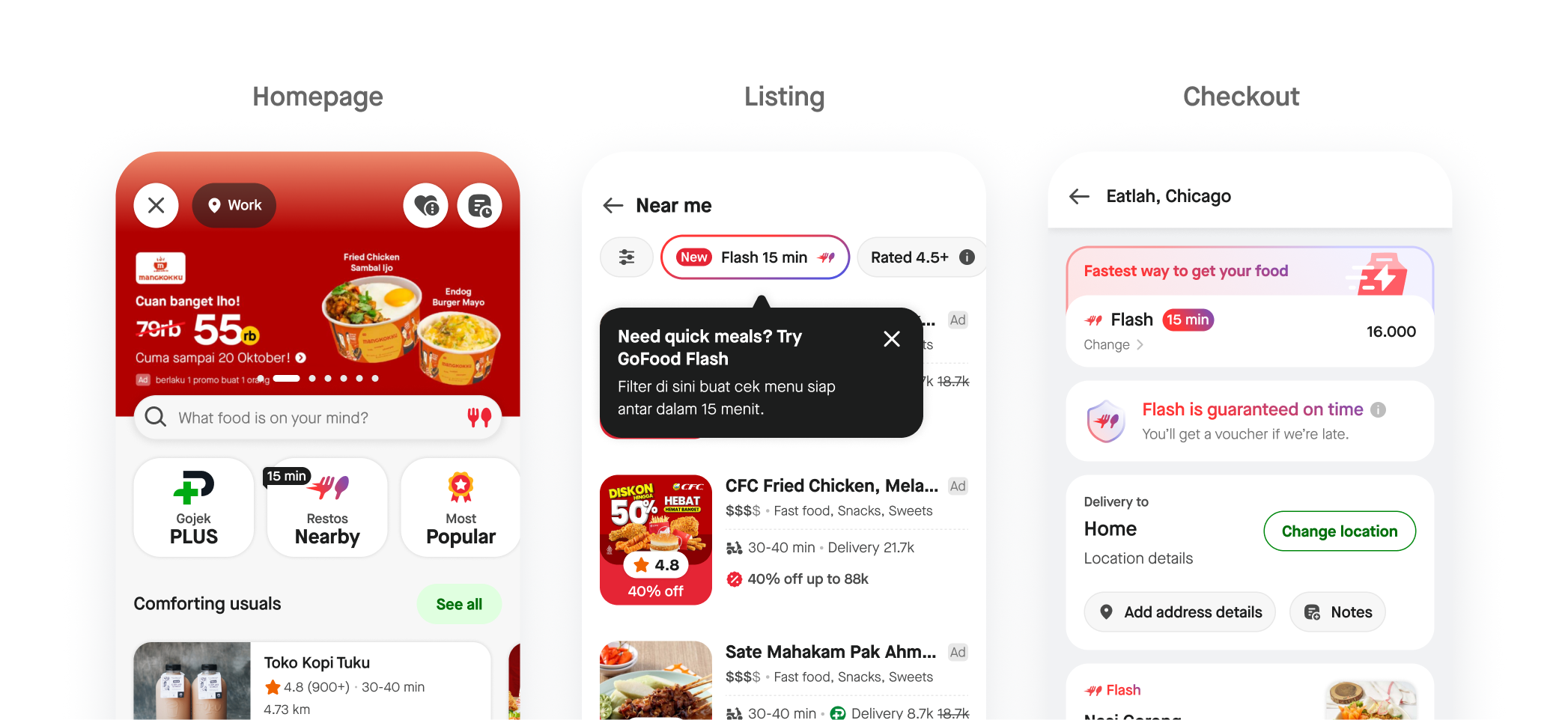
For a product the team had real conviction in, this was a miss. The logic at the time was reasonable — separating Flash would make it feel premium, focused, intentional. We were wrong about what "protecting" a product actually protects.
Instead of iterating on the surface — bigger badges, more entry points — we slowed down and talked to users. The research team ran interviews with power users who did use Flash and churned users who tried it once and didn't come back.
Power users · Early adopters
"Why isn't Flash available when I'm already browsing my usual merchants?"
They liked Flash and wanted to find it in their normal flow — not behind a separate door they had to remember to open.
Churned users · Tried once, didn't return
"I feel like I'm being forced to use Flash."
At checkout, they couldn't see Express or Regular. The thing they'd done a hundred times — compare options before committing — was gone.
"Both groups, from opposite ends of engagement, were telling us the same thing: stop making Flash its own world. Put it inside the world we already use."Research synthesis, GoFood Flash v2 diagnostic
I co-led a workshop with my PM, pulling in design, engineering, ops, and research. We mapped what we'd built against what users were asking for, brainstormed responses, and prioritised by impact and feasibility.
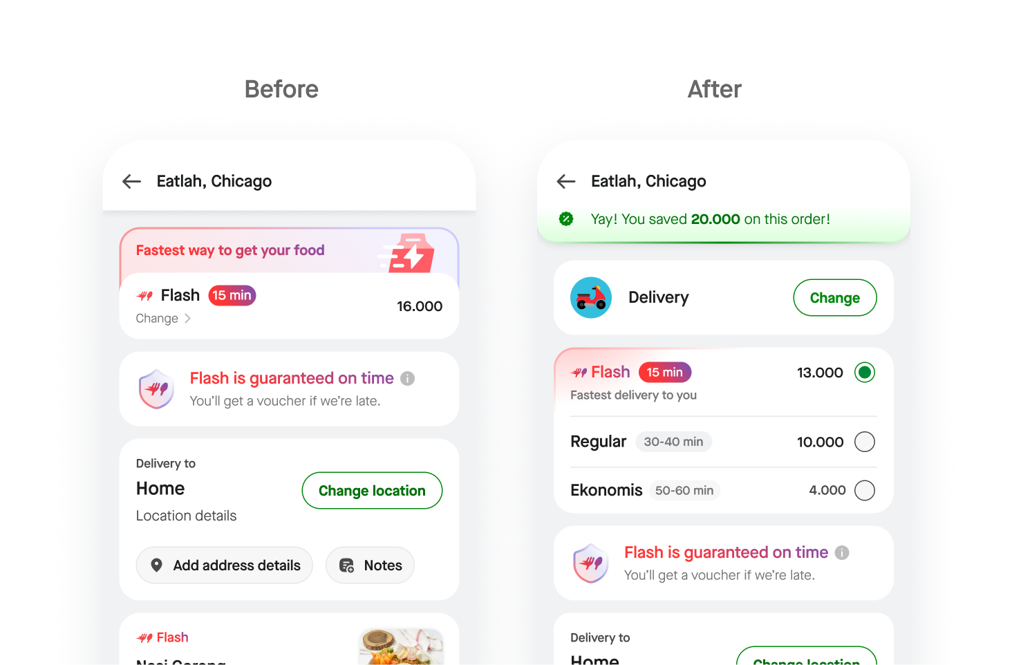
Flash label rolled out across
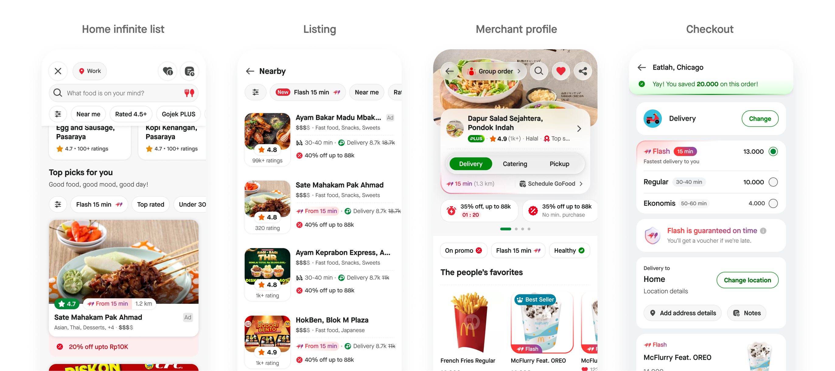
The label expansion required cross-team alignment that went well beyond screens. The MVP's failure mode was protective isolation. The fix required deliberate integration across every touchpoint Flash could plausibly appear on.
All metrics reflect Q4 2025 performance.
From 2,000 to 44,000 daily checkouts in four months. Adoption distributed across both new-to-Flash users and reactivated churned users.
The thing that moved the metric wasn't a new feature. It was removing the wall we'd put up around the old one. Flash didn't need to be bigger — it needed to stop being separate.
Up from under 1% post-MVP. Users discovering Flash naturally in their existing flow converted at a fundamentally different rate than users who had to seek it out.
Making Flash a native tier inside an existing flow — rather than a separate product to discover — was the entire lever. The design change was small. The product thinking behind it was the whole project.
"The change wasn't bigger. It was smaller. We stopped making Flash a parallel universe and made it a native option inside the flow users already knew."GoFood Flash v2 — post-launch summary
When you launch something new, there's a strong pull to seal it off — different funnel, different rules, different visual language — so it doesn't get diluted. Sometimes that's right. More often, you're trading discoverability and trust for the illusion of focus.
Our testing showed users understood and wanted Flash. It didn't catch that they wanted it inside the existing flow, not adjacent to it. The MVP launch was, in a sense, the usability test we couldn't have run earlier — and it was expensive.
The cost of those interviews with power users and churned users was tiny. The information gain was the entire project. We should have scheduled them on day 30 post-launch, not waited until we noticed the numbers weren't moving.
Co-leading the v2 workshop with my PM was as much "design work" as the wireframes. Getting the right people in the room, framing the problem so it was solvable, and producing decisions people would commit to — that's where the 20× came from.
Pre-MVP, I'd have included a "what if Flash were a label, not a funnel?" branch in the original design exploration. We had enough information at concept-test time to consider it. We didn't, because the parallel-funnel framing felt more like a "real launch." That bias is the one I want to keep watching for.